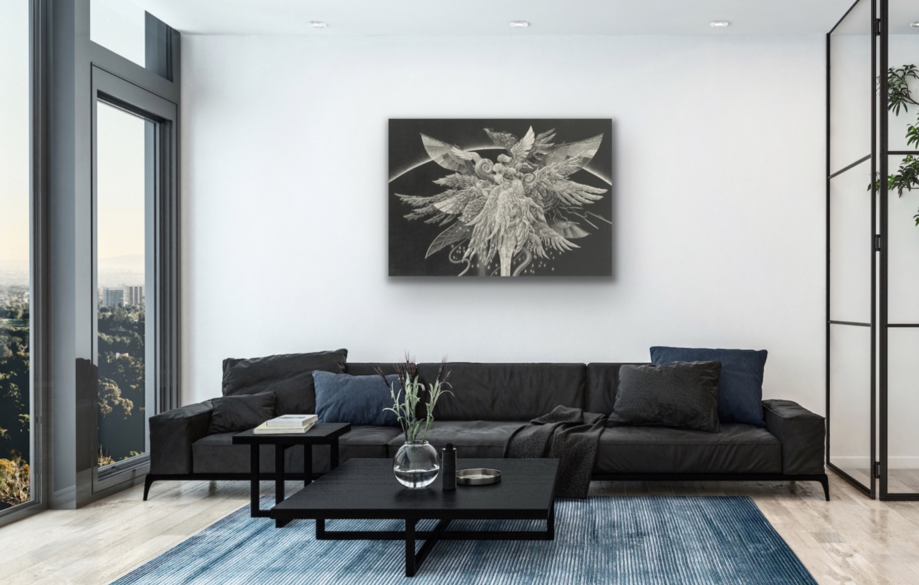
This article is sponsored by TRiCERA.
It is time for art
Do you remember how fresh you feel when you come out of a movie theatre and realize that you are still in the same reality as 2 hours before? Don’t you feel energized after a weekend getaway in the countryside? Adding original artworks to your home does that to you every day. It saves you from the staleness of daily life and refills your enthusiasm. If you have some printed duplicates, it is the best time to realize the power of originals instead. If you don’t have any, don’t worry, it is a perfect start.
The art will breathe life into your space. Let’s see why and how.
Why now? Let me answer with a question. Are you ready to spend more time at home? Everyone would agree that 2020 has been an extraordinary year. In this fast society, many of us were spending time outside with bosses, colleagues, and friends half a day. Then COVID-19, the looks of the modern lifestyle has changed dramatically. We have spent a couple of months entirely at home alone or with families. Society was not ready for the sudden change, and highly likely, our house was not either. It does seem to be an excellent time to improve this unequipped base where we now work, eat, and relax.
Why originals? Each piece of original artwork has its character and charisma, like movie actors. In its details, the journey of the artist has been recorded and engraved for you to watch. If it is an oil painting, the various layers of paints, interactions between the colors, and emotional brushstrokes will tell you a story. The originals are alive, and in there is the power.
How to critique an artwork?
Choosing an art may sound like a complicated process, but it’s not. I can break it down to easy five steps for you from the study in interior and color coordination, and my experiments.
First, you cannot skip considering your purpose for a room. At this point, you should be easily able to know the atmosphere that you want to achieve. For example, I imagine the living room – a welcoming atmosphere, dining room – uplifting, bedroom – calming, office space – energizing, personal space – freeing, kids room – inspiring, and so on. When you are lost in your choices later, you can come back to this atmosphere, the first impression, to choose which one is right.
Second, the style of the room is also essential. Even though the painting is famous, you don’t want to hang The Gleaners by Jean-François Millet in your modern living room, where you have coordinated a glass top coffee table and a sleek black leather sofa. Instead, you choose a piece that is modern and stylish for a sophisticated atmosphere. Probably black color matches well with your sofa too, for instance.
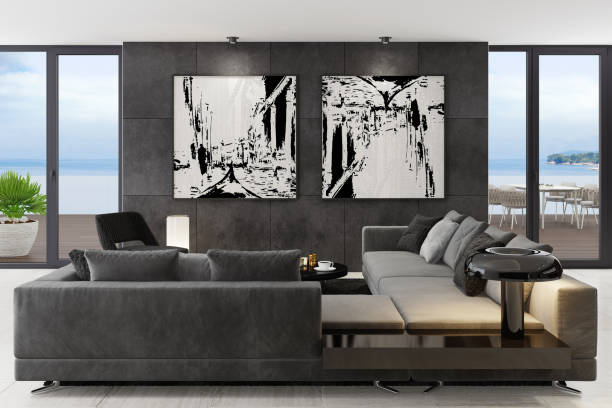
Now, you know the atmosphere and style of the room. The third step is to pick up the color of the place. Color coordination can be a difficult one among the first three steps. Still, you can navigate by asking these questions to yourself. Your favorite rug or curtain or sofa or the floor, what color are they? Which color has more presence in the room? Does the color of cushions on your couch stand out as an accent, but nothing is matching? The answer you are looking for is “coherence.” The room will look together by pairing the colors even when you have multiple tones.
Let’s check these first steps in another example. First, it is a living room, and the atmosphere is cozy and friendly. Second, you can see the casual and natural style of the furniture’s design and material. Third, there are multiple colors used in a room. It may not look simple to match at first sight. However, the yellow color of cushion, brown of the wooden furniture and the floor, and light shades of bluish-gray are all well connected in this light-toned painting. Without it, the room looks diffusive, but it appears harmonized and comfortable with it.
The scene is ready, and let’s talk about the fourth stage, introducing the actor, your art piece. Each piece has its character, and it represents your message in your choice. That warm and light-hearted piece above is comfortably cruising on the wall. You can imagine the owner would have a laidback personality. This stage is about finding your favorite actor or actress; this part is a fun one. Free your mind and follow your instinct. The right ones should be able to tell you something. For example, I would pick this unique and inspiring artwork for a kid’s room. The use of vivid colors and also the mixture of different materials tells me to think creatively and live fully.
How to label artwork?
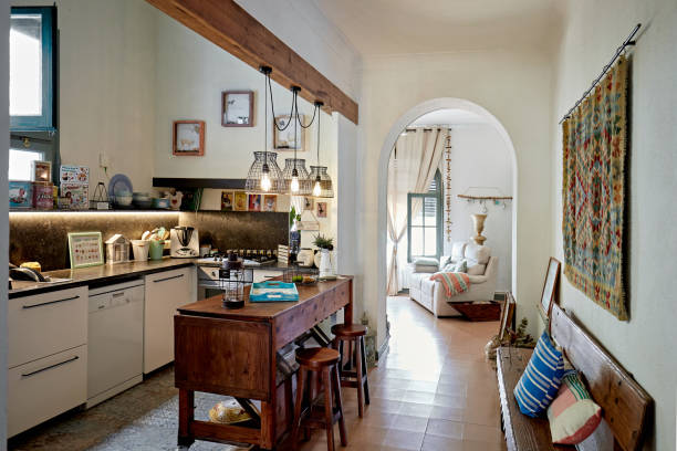
The last factor is the size relation, with the artwork and the room. The size you can occupy in a metropolitan city full of highrises like Tokyo or Hong Kong tends not to be glorious. You may not believe me when I say this: adding artwork can visually open up the limited space. The optical illusion is the reason why. By creating parallel lines across an area, you can create a sense of expansion. If you have an open space horizontally, such as above a sofa, put up a piece that is a wide rectangle. For a narrow space like hallways, hang a vertical one. In the next picture below, this dining area would look like a cramped dead-end space without the tapestry on the wall. (By the way, it is another good example of coherent coloration as well.) With vertical emphasis, it gains another depth.
There is another set of tips and caution about space and color. Artwork in lighter shades or of sceneries, in general, will boost the expansion effect. Darker or vivid colorings, on the other hand, concentrate the attention of your eyes. It is useful to know when setting the tone of your room. Avoid having a larger sized piece with vivid colors in a narrow room because it can be intimidating. But artwork can be energizing to have it near your office desk if it is smaller. If you want a calming effect in your tiny bedroom, find some scenery pieces in uncomplicated colors. It will give you some space to breathe.
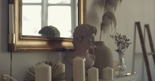
You are confident in finding your piece. Finally, where do you find it?
We indeed live in a convenient time. There are online market places and galleries for those who are not familiar with visiting art galleries. With the pandemic, more artists are listing online. Also, typically these online market places offer a more extensive range of prices and styles than a conventional gallery. They, of course, sift these gems through the selection process for ensuring quality. It is a great opportunity to discover the talents from all over the world from home. At a market place, you can navigate through from size, price range, materials, and so on with filters. TRiCERA.NET is one of those market places based in Tokyo, Japan. It introduces artists from the world, and of all stages from established to emerging. They also offer you free online art advisory services for your convenience. There is no reason for not taking advantage of the new trend in the art industry. Your new favorite artwork is more accessible than ever.
Four tips for positioning, styling, framing, and maintenance
- Positioning becomes much easier with a few tricks. Find some big piece of paper like newspaper or cardboard then tape it on the place you are planning to install. It is the easiest way to visualize the art and room size ratio. Using low adhesive tape to make a square is another easy way as well.
- Consider a diptych, triptych works, or gallery wall style if it does not feel right to decorate with just one large piece. It adds the rhythm on the wall and stylish impression on display. The random placement of small works, though, can give cluttering or suffocating impressions. It may work for your neighborhood cafe, but it may not be ideal for a home.
- Start with a frame with a simple style and colors. Simplicity will save your room from disorder when you plan to adjoin other pieces. Even when the contents are different, common framing will present them neatly. This picture is a big NO. Again, coherence is key.
- Avoid direct sunlight as a general rule of thumb. If inevitable, consider a frame with UV-protected glass. Avoid extreme change in atmospheres such as temperature or humidity; near the ventilation or air conditioning systems is not the best place. Some mediums such as paper are better protected with glass, but some others, such as canvas, need to breathe. Dust regularly with a dry, soft white cloth or brush. Never use chemicals to clean. Don’t hesitate to ask the staff if you are concerned. Good art store should be able to give you advice.
Looking for an apartment to buy or rent? find your perfect property using Spacious.hk, Hong Kong’s number one real estate platform.


